In the ever-evolving world of web design, color schemes are often treated as mere aesthetic choices, a subjective decision based on personal preferences or fleeting trends. However, beneath the surface of these vibrant hues and tones lies a fascinating realm of psychology, where colors wield the power to evoke emotions, influence behavior, and shape the entire user experience. Brace yourself, for we’re about to embark on a mind-bending journey into the psychological depths of web color schemes – a journey that will forever change the way you perceive and employ colors in your digital endeavors.
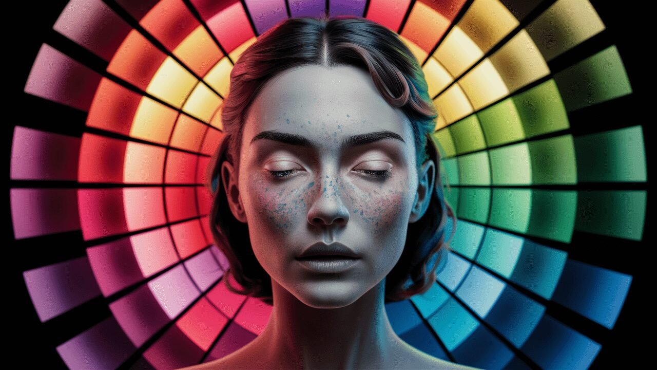
The Chromatic Enigma: Unveiling the Psychology of Color
Colors are more than just pleasing visual elements; they are potent psychological triggers that can profoundly influence our emotions, perceptions, and decision-making processes. This phenomenon, known as color psychology, has been the subject of extensive research and study, revealing the intricate connections between specific hues and the human psyche.
At the heart of color psychology lies the concept of emotional associations. Certain colors, such as red, are linked to feelings of passion, energy, and urgency, while others, like blue, evoke a sense of calm, trust, and reliability. These associations are deeply rooted in our cultural and evolutionary histories, transcending language barriers and societal norms.
But the psychological impact of colors goes beyond mere emotional responses. Studies have shown that colors can influence our cognitive processes, attention spans, and even our physiological responses. For instance, warm colors like red and orange are known to increase heart rate and stimulate appetite, while cool colors like green and blue have a more calming and soothing effect.
As web designers and developers, understanding the psychological underpinnings of color is crucial for creating compelling and effective user experiences. By harnessing the power of color psychology, we can strategically employ color schemes that resonate with our target audiences, elicit desired emotions, and ultimately, drive conversions and engagement.
The Color Conversion Catalyst: Leveraging Hues for Higher Conversions
In the highly competitive world of online business, every element of a website’s design can potentially influence a user’s decision to convert – that is, to make a purchase, sign up for a service, or take any desired action. And when it comes to driving conversions, the strategic use of color psychology can be a game-changer.
For example, the color red is widely associated with urgency, excitement, and a sense of immediacy. By strategically incorporating shades of red into call-to-action buttons, limited-time offers, or countdown timers, businesses can create a sense of scarcity and compel users to take immediate action.
On the other hand, colors like green and blue are often linked to feelings of trust, reliability, and stability – qualities that are highly desirable in industries like finance, healthcare, and legal services. By crafting color schemes that evoke these emotions, businesses can foster a sense of confidence and credibility with their target audiences, ultimately increasing conversions and customer loyalty.
However, it’s important to note that the psychology of color is not a one-size-fits-all solution. Different industries, target demographics, and cultural contexts may have unique color associations and preferences. Effective color psychology in web design requires a deep understanding of the target audience, as well as ongoing testing and optimization to ensure that the chosen color schemes resonate and drive the desired outcomes.
The Cultural Kaleidoscope: Navigating the Nuances of Color Perception
While color psychology aims to uncover universal truths about the emotional and cognitive impacts of different hues, it’s crucial to recognize that color perception is not a monolithic phenomenon. Cultural norms, societal values, and regional contexts can significantly influence the ways in which colors are interpreted and associated with specific emotions or meanings.
For instance, in Western cultures, the color white is often associated with purity, innocence, and cleanliness, making it a popular choice for healthcare and wellness brands. However, in some Eastern cultures, white is traditionally linked to mourning and death, potentially evoking unintended negative connotations.
Similarly, the color red, which is widely used to convey excitement and urgency in Western marketing, may hold different symbolic meanings in other cultural contexts. In China, for example, red is deeply intertwined with notions of good luck, prosperity, and happiness, making it a popular choice for celebratory occasions and festivals.
As web designers and developers, it’s essential to approach color psychology with a culturally sensitive lens. Failing to account for these nuances can lead to unintended consequences, such as offending or alienating certain user groups, or simply failing to resonate with the intended audience. By conducting thorough research, consulting with cultural experts, and continuously testing and adapting, we can create color schemes that transcend cultural boundaries and resonate with diverse global audiences.
The Accessibility Imperative: Designing Inclusive Color Schemes
In the pursuit of aesthetically pleasing and psychologically compelling color schemes, it’s all too easy to overlook an equally important consideration: accessibility. Color blindness and other vision-related disabilities can significantly impact how users perceive and interact with digital content, making inclusive color choices a crucial aspect of web design.
One of the most common forms of color vision deficiency is the inability to distinguish between certain shades of red and green – a condition that can render many popular color schemes virtually indistinguishable. By failing to account for this disability, web designers run the risk of creating interfaces that are confusing, difficult to navigate, or even completely illegible for a significant portion of their audience.
However, the challenges of accessible color design go beyond just color blindness. Factors such as contrast ratios, background colors, and the overall color palette can impact the legibility and usability of digital content for users with various vision impairments or conditions like dyslexia.
Fortunately, numerous guidelines and best practices exist to help web designers create inclusive and accessible color schemes. By adhering to established standards, conducting user testing with diverse audiences, and leveraging accessibility tools and plugins, we can ensure that our color choices not only evoke the desired psychological responses but also provide an enjoyable and inclusive experience for all users, regardless of their visual abilities or disabilities.
The Chromatic Catalyst: Leveraging Color for Enhanced Usability
In the realm of web design, color schemes play a crucial role not only in evoking emotions and influencing user behavior but also in shaping the overall usability and navigability of digital interfaces. By strategically employing color psychology principles, designers can create intuitive and user-friendly experiences that enhance engagement and reduce cognitive load.
One key aspect of usability is visual hierarchy and information architecture. Through the strategic use of contrasting colors, designers can guide users’ attention and highlight critical elements, such as navigation menus, calls-to-action, or important content sections. This visual cuing not only improves the overall flow and comprehension but also reduces the cognitive effort required to navigate and consume digital content.
Furthermore, color psychology can be leveraged to create visual cues and associations that aid in the learning and memorization of interface elements. For example, consistently using specific colors for certain types of actions or notifications can help users quickly recognize and respond to these cues, reducing confusion and enhancing overall usability.
However, it’s important to strike a balance between visual appeal and usability when employing color psychology in web design. Overuse or haphazard application of contrasting colors or vivid hues can lead to visual clutter, distraction, and even sensory overload, ultimately undermining the user experience. Effective usability through color psychology requires a thoughtful and restrained approach, guided by user research, testing, and iterative refinement.
The Emotional Tapestry: Weaving Color into Brand Identity
In the ever-competitive digital landscape, establishing a strong and memorable brand identity is paramount for businesses and organizations seeking to stand out and connect with their target audiences. And color psychology plays a pivotal role in shaping this brand identity, serving as a powerful visual cue that can evoke specific emotions, associations, and perceptions.
The strategic selection of brand colors can have a profound impact on how a business is perceived by its audience. For instance, a finance company may opt for shades of blue and green to convey a sense of stability, trust, and growth, aligning with the desired brand image and values. Conversely, a high-energy sports brand might choose bold, vibrant hues like red and orange to evoke feelings of excitement, passion, and dynamism.
However, brand color psychology goes beyond just the initial emotional associations. Over time, consistent and effective use of color can create strong psychological links between the brand and specific emotions, memories, or experiences. This process of conditioning can be incredibly powerful, transforming a brand’s color scheme into a potent visual trigger that elicits an immediate emotional response from its audience.
But building a strong and lasting brand identity through color psychology is no easy feat. It requires a deep understanding of the target audience, their cultural contexts, and the desired brand positioning. Additionally, it demands consistency and cohesion across all brand touchpoints, from digital interfaces to physical products and marketing materials, ensuring that the psychological associations remain intact and reinforced at every interaction.
The Chromatic Continuum: Adapting to Emerging Trends and Technologies
In the dynamic world of web design and technology, trends and innovations are constantly reshaping the landscape, introducing new challenges and opportunities for leveraging color psychology. From the rise of dark mode interfaces to the advent of immersive technologies like virtual and augmented reality, the role of color in shaping user experiences is continuously evolving.
One emerging trend that has garnered significant attention is the adoption of dark mode interfaces, which feature a predominantly dark color scheme designed to reduce eye strain and improve visibility in low-light conditions. While this trend may seem purely functional, it also presents intriguing psychological implications. Dark color schemes can evoke a sense of sophistication, mystery, or even intimacy, potentially influencing user perceptions and behaviors in unexpected ways.
Additionally, the proliferation of immersive technologies, such as virtual reality (VR) and augmented reality (AR), introduces new dimensions to color psychology. In these highly realistic and dynamic environments, colors can play a crucial role in enhancing the sense of presence, creating emotional resonance, and guiding user attention and interactions.
As new technologies and design trends continue to emerge, it’s essential for web designers and developers to stay abreast of the latest research and best practices in color psychology. By embracing a mindset of continuous learning and adaptation, we can ensure that our color choices remain relevant, effective, and aligned with the evolving needs and expectations of our audiences.
The Ethical Prism: Navigating the Moral Implications of Color Psychology
As we delve deeper into the realm of color psychology and its powerful influence on human emotions, perceptions, and behaviors, it’s crucial to consider the ethical implications of leveraging these psychological principles in web design and marketing.
On one hand, the strategic use of color psychology can be seen as a means of enhancing user experiences, fostering emotional connections, and ultimately creating more engaging and effective digital interfaces. However, there is a fine line between leveraging psychological principles for user benefit and employing manipulative tactics that exploit human vulnerabilities for personal or commercial gain.
For instance, the use of specific color combinations and visual cues to create a sense of urgency or scarcity, while potentially effective in driving conversions, could be viewed as a form of psychological coercion, undermining user autonomy and decision-making processes.
Furthermore, the application of color psychology in web design raises questions about privacy and consent. Should users be made explicitly aware of the psychological principles at play, or is it acceptable to employ these techniques without explicit disclosure? These are complex ethical dilemmas that must be carefully navigated, weighing the potential benefits against the risks of exploitation or deception.
The Chromatic Frontier: Exploring the Future of Color Psychology in Web Design
As we stand at the precipice of technological advancements and societal shifts, the future of color psychology in web design promises to be an exciting and ever-evolving frontier. From the integration of artificial intelligence and machine learning to the emergence of new human-computer interaction paradigms, the ways in which we perceive and harness the power of color are poised to undergo a profound transformation.
One area of great potential lies in the integration of artificial intelligence (AI) and machine learning (ML) technologies into web design and color selection processes. Imagine intelligent systems that can analyze user behavior, preferences, and demographic data to dynamically generate personalized color schemes tailored to individual users, optimizing the emotional and psychological impact in real-time.
Additionally, the rise of new interaction modalities, such as voice interfaces and gesture-based controls, opens up intriguing possibilities for leveraging color psychology in non-traditional ways. As we move beyond the confines of traditional screen-based interfaces, the role of color in shaping emotional responses and guiding user interactions will need to adapt and evolve.
However, as we embrace these technological advancements, it’s crucial to maintain a human-centric approach to color psychology in web design. While AI and machine learning can augment our capabilities, the intricate nuances of human emotion and cultural context should never be overlooked. The future of color psychology lies in finding the perfect harmony between technological innovation and human empathy, creating digital experiences that resonate on both a rational and emotional level.
The Chromatic Journey: Embracing the Power of Color in Web Design
As we reach the end of our captivating exploration into the psychological depths of web color schemes, one thing becomes abundantly clear: color is more than just a visual element; it is a powerful tool that can shape emotions, influence behavior, and ultimately, define the entire user experience.
Throughout this journey, we’ve delved into the intricate connections between specific hues and the human psyche, uncovering the universal truths and cultural nuances that inform our emotional responses to color. We’ve explored the applications of color psychology in driving conversions, enhancing usability, and building compelling brand identities, all while navigating the ethical complexities that arise from leveraging these psychological principles.
But our journey has also revealed that color psychology is not a static discipline; it is a dynamic and ever-evolving field, shaped by emerging trends, technological advancements, and the constant ebb and flow of human experiences and perceptions. As we look to the future, the role of color in web design will undoubtedly continue to evolve, embracing new technologies, interaction modalities, and cultural shifts.
Ultimately, the true power of color psychology lies in its ability to connect with the very essence of what makes us human – our emotions, our desires, and our innate drive to seek meaning and resonance in the world around us. By embracing this power and harnessing it responsibly and empathetically, we can create digital experiences that transcend mere functionality and aesthetics, forging lasting emotional connections with our audiences and leaving an indelible mark on the ever-changing landscape of web design.
Conclusion
In the ever-evolving realm of web design, the psychological impact of color schemes can no longer be overlooked or treated as a mere afterthought. As we’ve discovered throughout this captivating exploration, colors wield a profound influence over our emotions, perceptions, and behaviors, shaping the very essence of the user experience.
From driving conversions and enhancing usability to forging powerful brand identities and navigating ethical dilemmas, the strategic application of color psychology has emerged as a critical aspect of modern web design. By understanding the intricate connections between specific hues and the human psyche, we can create digital interfaces that resonate on a deeper, emotional level, fostering lasting connections with our audiences.
However, our journey has also revealed that color psychology is a complex and nuanced discipline, one that demands a deep appreciation for cultural nuances, emerging trends, and the ever-evolving landscape of technology and human-computer interaction. As we embrace the future of web design, it’s essential that we approach color psychology with a mindset of continuous learning, adaptation, and ethical responsibility.
Ultimately, the true power of color psychology lies not in manipulation or deception but in empathy and understanding. By harnessing this power with a human-centric approach, we can create digital experiences that transcend mere functionality and aesthetics, forging emotional connections that leave an indelible mark on the hearts and minds of our audiences.
So, whether you’re a seasoned web designer, a budding entrepreneur, or simply a curious soul fascinated by the intersection of psychology and technology, embrace the chromatic journey and unlock the transformative potential of color in your digital endeavors. For in the vibrant tapestry of hues and tones lies a gateway to understanding the very essence of human experience – a gateway that promises to redefine the boundaries of what’s possible in web design and beyond.