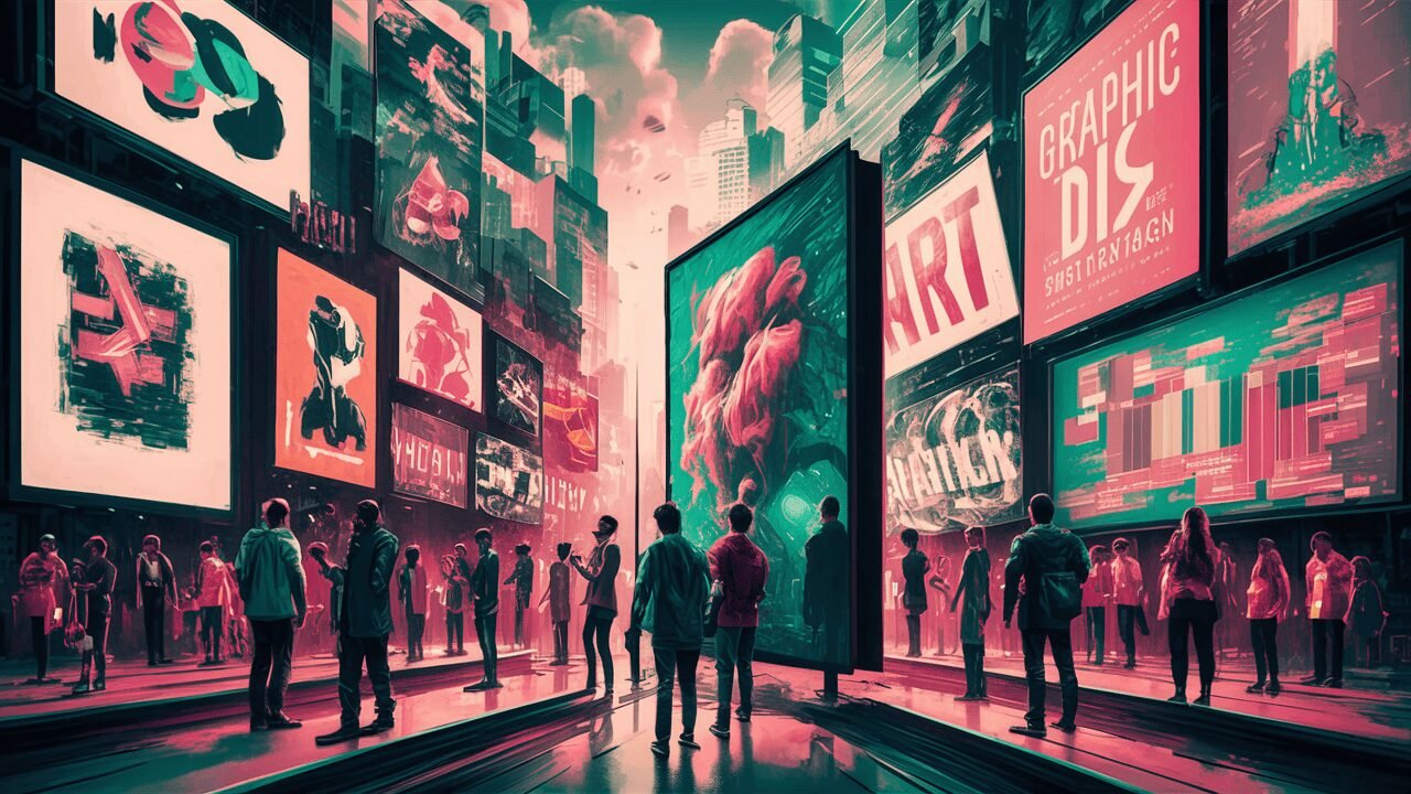
Have you ever stopped to consider how the design of a website, advertisement, or product packaging influences your behavior as a consumer? The field of Design Psychology Consumer Behavior delves into the intricate ways in which graphics impact our decision-making processes. From the colors used to the shapes employed, graphic design plays a crucial role in shaping our perceptions and guiding our actions. In this blog post, we will explore the fascinating world of Graphic Influence on Behavior and uncover the secrets behind effective design strategies.
The Power of First Impressions: Visual Appeal in Milliseconds
In the blink of an eye, faster than it takes to swipe right on your favorite dating app, visual appeal works its magic on us. Imagine this: you’re scrolling through a sea of websites or strolling down an aisle packed with products, and bam! Something catches your eye. It’s not just any random thing; it’s the result of meticulously crafted graphic design working its silent mojo on your subconscious. This split-second judgment, based purely on how visually attractive something is, can make or break a brand’s chance of winning your heart (and, let’s be honest, your wallet).
This phenomenon isn’t just some fluke of human nature. Science backs it up! Studies show that our brains are wired to process visual information at an astonishing speed, making our initial impressions heavily based on design elements like symmetry, balance, and the clever use of white space. These aren’t just fancy terms that designers throw around to sound sophisticated. They’re the secret ingredients that make you feel a certain way about a brand before you even realize it.
And it doesn’t stop there. That harmonious arrangement of visuals you just fell for? It’s like a silent ambassador for the brand, whispering sweet nothings about trustworthiness, quality, and even innovation. Whether it’s a sleek, minimalist website that screams efficiency or a colorful, eclectic package that dances off the shelf and into your cart, the magic of first impressions in graphic design is real.
So, the next time something catches your eye and you can’t quite pinpoint why remember, it’s all by design. Literally. The world of graphic influence on behavior is a fascinating dance of visuals, playing on our instincts and preferences without missing a beat.
Color Psychology: The Emotional Palette
Dive into the rainbow of possibilities where each hue holds a secret power to sway our moods and decisions. Welcome to the world of Color Psychology, where the emotional palette is not just a collection of pretty shades but a strategic tool in the hands of savvy designers. Picture this: a splash of red that doesn’t just decorate but electrifies, invoking passion and urgency that might just nudge you to hit that “Buy Now” button. Or a serene blue that doesn’t merely fill space but builds trust, whispering “You’re in safe hands” as you navigate through a website.
But wait, there’s more to this colorful story. Ever wonder why eco-friendly brands love to bask in the glow of green? It’s not just because it reminds you of trees (though that’s part of it). Green speaks of growth, harmony, and renewal, tapping into our deepest yearnings for a healthier planet. On the flip side, luxurious brands often flirt with purple, a color that’s long been associated with royalty, sophistication, and a touch of mystery.
Designers, wielding their color wheels like modern-day wizards, mix and match these hues to stir up the exact emotional cocktail they desire in their audience. It’s a delicate dance of color theory and psychology, where understanding the cultural and personal associations with colors is just as crucial as the colors themselves. So, the next time a particular shade tugs at your heartstrings or sparks joy, take a moment to appreciate the masterful hand of a designer who’s chosen just the right tint to make that connection. After all, in the grand tapestry of design, colors are the threads that weave our emotions together, crafting experiences that resonate on a deeply personal level.
The Influence of Shapes and Symbols
Step right up to the enchanting world of shapes and symbols, the unsung heroes of graphic design that subtly sway our emotions and choices. Ever noticed how a simple circle feels welcoming and inclusive, like a warm hug or a round table discussion among friends? Or how a square exudes stability and reliability, akin to the steadfastness of a trusty old box that safely stores your treasures? That’s shapes whispering sweet somethings into our subconscious, folks.
Diving deeper, let’s talk symbols. These aren’t just random doodles; they’re the shorthand of visual communication, packing a punch of meaning in tiny graphic packages. Take, for instance, the power of a simple heart symbol. It transcends language barriers, representing love and compassion universally. Or consider the recycle symbol, a trio of arrows chasing each other in an endless loop, quietly nudging us towards sustainability without uttering a single word.
But wait, there’s a plot twist in this visual narrative. While a shape or symbol might sing a song of harmony and peace, pair it with a contrasting element, and voila! You’ve got yourself a dynamic duo that sparks curiosity and engagement. Imagine a rugged, jagged triangle atop that trusty old box. Suddenly, it’s not just reliable; it’s daring and adventurous, ready to take on the world!
Designers, the magicians behind the curtain, harness the power of these visual elements, carefully selecting and combining them to tell a story, evoke emotions, and even influence decisions. It’s a dance of geometry and iconography, choreographed to guide the viewer’s eye and heart where they subtly, yet significantly, want them to go.
So next time you’re captivated by a logo, an ad, or even a button on a website, take a moment to decode the shapes and symbols at play. They’re not just there for their good looks; they’re working hard behind the scenes to make a connection, tell a story, and perhaps even persuade you to take action. And isn’t that just a fascinating shape of affairs?
Typography: The Voice of Your Design
Imagine walking into a party and hearing the most captivating voice across the room—it draws you in, and you can’t help but listen. That’s typography in the world of design; it’s how your brand says hello and keeps the conversation going. Whether it’s whispering sweet nothings with a delicate serif or shouting from the rooftops in a bold sans-serif, fonts have personalities and stories of their own.
But don’t just pick a typeface because it’s the flavor of the month. Think of it as matchmaking for your brand. A gothic font might scream “vintage chic” for a boutique coffee shop but could cause a tech startup to stumble, appearing out of touch. The key is in finding that perfect font that resonates with your brand’s voice and values. It’s like finding the perfect pair of shoes that not only look fabulous but feel like they were made just for you.
Beyond personality, let’s talk legibility. Ever tried reading a menu in a dimly lit restaurant, squinting at the elegant but utterly unreadable script? It’s like trying to decode a secret message when all you want is a burger. A well-chosen typeface guides your audience effortlessly through your message, ensuring they absorb every word without a furrowed brow.
And then, there’s harmony. Just as in a choir, where voices blend to create a beautiful melody, typography works alongside color, imagery, and layout to compose a design that sings. Mix and match fonts with care—a jarring combination can be like nails on a chalkboard, while the right pairing can be music to your eyes.
So, let your design speak volumes. With thoughtful typography, your brand can whisper, chat, or boldly proclaim its presence, engaging hearts and minds in a conversation they’ll want to continue.
The Role of Imagery in Storytelling
Step into the vivid world of imagery, where every pixel tells a tale and every illustration holds a universe of emotions. Imagery, in its myriad forms, is the linchpin of storytelling in design, breathing life into ideas and weaving narratives that tug at the heartstrings or spark bursts of laughter. When designers harness the power of high-quality photographs, dynamic illustrations, and impactful graphics, they’re not just decorating a space; they’re crafting stories that resonate on a profound level.
Imagine a photograph that captures the golden glow of dawn, instantly evoking a sense of new beginnings and boundless possibilities. Or an illustration that playfully navigates the complexities of modern life, making you chuckle and nod in agreement. These aren’t just visuals; they’re invitations to experience, feel, and connect.
The magic lies in how these visual stories engage our emotions and imagination, inviting us into a world crafted by the designer. It’s like being handed a key to a secret garden where every corner reveals a new delight. Through the strategic use of imagery, designers can evoke powerful feelings, inspire action, or simply bring a moment of joy.
But here’s the kicker: it’s not just about throwing in a pretty picture and calling it a day. It’s about selecting imagery that aligns with the narrative arc of the brand or product, ensuring that each visual element contributes to a cohesive and compelling story. So, as you navigate the realms of graphic design, keep your eyes peeled for those visual storytellers. They’re the ones painting pictures worth a thousand words, capturing imaginations and weaving the fabric of unforgettable brands.
Consistency is Key: Building Brand Recognition
Ah, consistency, the unsung hero of the branding world, akin to always having your coffee made just the way you like it – comforting, reliable, and downright necessary. It’s the secret sauce that transforms a hodgepodge of visual elements into a harmonious brand symphony that consumers recognize and hum along to. Picture this: you’re in a crowded market, and from the corner of your eye, you spot a familiar color scheme, a well-known logo, and that unmistakable typography. Like a lighthouse guiding ships home, these elements beckon you amidst the chaos, reinforcing a sense of trust and familiarity.
This isn’t by happenstance, folks. This is the power of consistency working its magic, stitching together every post, package, and pixel in a cohesive narrative that tells the world, “We’re more than just a brand; we’re an experience.” It’s like wearing your favorite team’s jersey; it signals to others (and reminds yourself) where your loyalties lie.
But here’s the kicker: achieving this level of brand recognition isn’t just about sticking to the same colors or fonts. It’s about echoing your brand’s core values and personality across all platforms – from your website to your social media profiles, from your business cards to your billboards. By keeping these elements consistent, you’re not just making your brand easy on the eyes; you’re embedding it in the hearts and minds of consumers everywhere, crafting a visual language that speaks volumes without uttering a word. And in the bustling marketplace of today, that’s not just clever; it’s crucial.
Design with Purpose: Solving Problems and Enhancing Usability
Let’s dive into the nitty-gritty of design, where beauty meets brains in a delightful tango of functionality. It’s not just about making things pretty; it’s about smart design that solves real-world conundrums and smooths out those pesky usability wrinkles. Picture navigating a website with the ease of flipping through your favorite magazine, where everything is right where you expect it to be. That’s the genius of user-centered design at work. It’s like having a personal guide in the digital wilderness, making sure you never hit a dead end or fall into a frustration pit. From crystal-clear labels that make shopping a breeze to buttons that beckon with the promise of simplicity, every element is meticulously crafted with the user in mind. This is where design rolls up its sleeves and gets down to business, ensuring that every interaction is as seamless as putting on your favorite pair of jeans. So, next time you glide through a user-friendly site or product, tip your hat to the design wizards behind the curtain, making your journey effortlessly enjoyable.